WELCOME IN
Analyst's diary
Analyst’s Diary is an independent analytical platform for anyone interested in data, insights, and meaningful observations from the world around us. The project combines data-driven outputs with written analyses, offering accessible yet thoughtful perspectives on topics ranging from sociology and international affairs to sport and broader societal trends.The aim of Analyst’s Diary is to inform and contextualize. Rather than presenting data in isolation, the project focuses on connections, patterns, and alternative viewpoints, helping readers see familiar topics from different angles. Content is designed both for readers who enjoy working with data and for those who simply like to take time to read and reflect on well-structured articles.In addition to written articles, Analyst’s Diary also includes a podcast that explores selected topics in greater depth. Each episode expands on published analyses, offering more context, explanation, and reflection that does not always fit into written form. Links to podcast episodes can be found directly within articles or in the social media section.
Education
How to Visualize Data the Right Way part 1
Visualization does not end with the chart itself. This section looks at how text, labels, scales, and contextual elements shape the way data are read and understood. It shows where explanatory text belongs, how scale choices influence perception, and why even small design decisions can change the meaning of otherwise correct results.
Education
How statistics lie
Statistics can be correct and still misleading. This article explores how accurate results may lead to false interpretations through selective presentation, framing, or visual emphasis. Using concrete examples, it highlights why readers should approach statistical outputs critically and how easily numbers can tell a distorted story without being factually wrong.
Sport
home field advantage
Home field advantage has long been one of the most debated factors in professional sports, and the NFL is no exception. Using data from the 2024 regular season, this analysis examines whether AFC teams truly perform better at home than on the road. By comparing scoring, points allowed, and win probabilities, the article reveals not only a clear home advantage but also several surprising nuances. The results suggest that while home games still matter, success away from home plays a crucial role in elite performance.
Education
Survivorship bias
Survivorship bias is a subtle error in reasoning where we focus only on the data that remain visible while ignoring what is missing. Those missing cases often carry crucial information. When overlooked this bias can lead to misleading conclusions in data analysis business and everyday decision making.
Education
How to Visualize Data the Right Way part 2
Good data deserve the right visual form. This part focuses on how to choose appropriate charts and visual structures so results are communicated clearly and accurately. It explains which types of graphs work best for different kinds of data and why the wrong choice can hide the very insight the data are meant to show.
Sport
UK is kingdome of trains
Krátce o tom článku, aby to diváka donutilo kliknout-DÁT TEN NÁZEV ČLÁNKU JAKO ODKAZ NA NĚJ
Arcu auctor
Elementum col elit
Lectus magna magnis facilisis congue ultrices. Natoque sed nascetur justo tristique amet lacus ultricies tempor. Primis mauris cursus et aliquet non lobortis pharetra ut. Cursus congue auctor erat.
Vulputate nibh
Auctor sem porta
Eget leo magnis venenatis fusce posuere. Ultrices massa morbi non ante magnis nascetur vivamus nisi. Diam aliquam ultrices neque fusce ut pharetra massa commodo. Enim egestas facilisis ultrices.
ABOUT ME
I am a Social Science Data Analytics student at Palacký University with a strong interest in human behavior, data, and systems. I completed a three-month internship at NMS Market Research, where I worked with real-world datasets and research outputs.Alongside my academic work, I competed in ball hockey at a high level, becoming a World Champion, a member of the World Cup All-Star Team, and a Czech Extraliga runner-up. I am also a graduate of the Leadership Matters program supported by the U.S. Embassy. This experience, alongside my ball hockey career, shaped my discipline, teamwork, and long-term performance mindset.I work primarily in R and SPSS and focus on sociology, politics, and infrastructure, with a particular interest in aviation and rail transport where technology, organization, and human decision-making intersect. I enjoy exploring connections between data, behavior, and systems, and approaching problems from multiple perspectives.

participate on the surveys
Analyst’s Diary occasionally conducts small research projects focused on society, behavior, technology, and everyday life. You can participate in the current surveys below. All responses are anonymous and contribute to data-driven articles and analyses published on this site.
Airline Experience Survey
Share your experiences with airlines, airports, and air travel. The survey focuses on passenger satisfaction, travel behavior, and airline preferences.
⏱ Duration: 3–5 minutes
How statistics lie
Even accurate statistics can lead to wrong conclusions if they are presented without proper care and context. The way numbers are visualized, summarized, and framed strongly influences how they are understood by the reader. Charts, averages, or percentages may appear objective, yet they always highlight some aspects of reality while downplaying others. Without clear explanation and transparent presentation, correct results can easily be misunderstood or become misleading. That is why responsible statistical communication is not only about getting the numbers right, but about presenting them in a way that supports fair and accurate interpretation.
US Presidential Election 2016: When the Map Lies but the Data Do Not
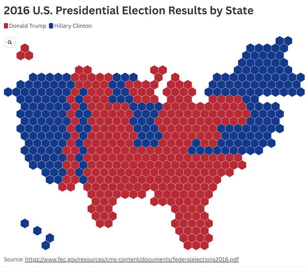
The 2016 US presidential election is one of the most well known examples of how data visualization can fundamentally distort reality. Donald Trump won the election even though he received fewer votes than his opponent. This fact alone is surprising to many people because we intuitively expect the winner of an election to be the candidate who receives the highest number of votes. In the American electoral system, however, the outcome is decided by electors, not by the direct popular vote. Shortly after the election, a map of the United States spread widely across media and social networks. The map was almost entirely colored red. At first glance, it appeared to be clear evidence of a sweeping Republican victory across the entire country. For many people, it became a visual confirmation that Trump had the support of the majority of America. This impression, however, was largely misleading.The problem was not the election data themselves, but the way they were displayed. A traditional state map primarily shows geographic area, not the number of inhabitants or voters. Large and sparsely populated states therefore occupy vast areas on the map, even though relatively few people live there. These states also have a low number of electors, which limits their real influence on the election result. In contrast, densely populated states such as California or New York appear relatively small on the map, despite being home to tens of millions of people. Their actual weight is therefore visually strongly underestimated. The map highlights space rather than population and creates an image that does not correspond to the distribution of votes. The result is a visualization that supports a very strong but misleading narrative.Once a cartogram or so called tile map is used instead, where one unit corresponds to a specific number of inhabitants or electors, the picture of the election changes dramatically. It suddenly becomes clear where support for individual candidates was truly concentrated. Small but populous states are no longer visually marginalized and their importance becomes much more apparent. At the same time, it becomes evident that vast areas with few inhabitants do not carry the decisive weight suggested by the traditional map. The same data begin to tell a completely different story. In neither case are the numbers incorrect. The difference lies solely in what the visualization emphasizes and what it hides. This example clearly shows that a map is not a neutral tool, but a powerful interpretive framework. It can very easily shape public perception of reality and political sentiment. That is why it is always important to ask what exactly a given map shows and especially what it does not show. The data did not lie. The visual interpretation was misleading.
Image 1: Election Results by State Area: A Misleading View of the 2016 U.S. Election
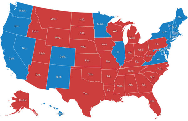
Source: https://www.nytimes.com/elections/2016/results/president
Graph 1: How the Picture Changes When Voters Matter More Than Area-U.S. Presidential Election Results Cartogram (2016)
Manipulating Scale: How to Turn a Small Difference into a Crisis
Another very common way statistics can create a misleading impression is through manipulation of axis scales in graphs. This issue appears mainly in media, political communication, and various presentations where a chart is meant to support a particular narrative. At first glance, such a graph may appear completely correct and professional. A typical example is a comparison of two values, such as inflation at 4.0 percent and 5.5 percent. On paper, this represents a difference of 1.5 percentage points, which is a change with some significance but not an extreme one. However, if the graph is designed so that the axis does not start at zero but instead at 3.8 percent, the difference begins to look dramatic. Bars or curves visually diverge much more, and the change appears far larger than it actually is. The viewer may then gain the impression that inflation has surged or that the economic situation has deteriorated dramatically.


In reality, the absolute change has not changed at all. Only the method of visualization has. The same data plotted on an axis starting at zero would appear much calmer and more moderate. The difference would still be visible, but it would not feel alarming. This contrast shows that the numbers themselves are not the problem. The problem lies in the context into which they are placed and the visual framing chosen by the author of the chart. The axis scale determines whether a change is perceived as a minor deviation or as a crisis. The same principle can also be used in the opposite direction. If we want to obscure or downplay a difference, we choose a very wide scale. In that case, graphs look almost identical even when the values differ significantly.Such a graph can create the impression that nothing has really changed, even in situations where the change has real consequences. This approach often appears in presentations intended to reassure the public, investors, or voters. Negative developments are visually diluted within a wide scale and lose urgency. Readers or viewers may not notice the difference at all or may underestimate it. Axis scaling thus becomes a very powerful tool for interpreting data. In such cases, the graph does not convey information but works with emotions. Sometimes it triggers panic, other times false calm. Yet the underlying data remain the same in both cases. That is why it is essential to always check where an axis starts and where it ends. Without this context, a graph may appear convincing while being misleading at the same time. Proper visualization should reflect the real significance of a change, not serve political, media, or marketing intentions. Once scale becomes a tool of manipulation, the graph stops informing and starts influencing, even when the values themselves are correct.
Is the Average or the Median Better
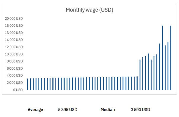
Misleading interpretation of statistics does not concern only elections or sports. It appears very often in everyday economic and social data as well. A typical example is the use of averages, which may seem intuitive and objective at first glance. Average wages are frequently used when comparing cities, regions, or entire countries. When we look more closely, however, we find that averages can significantly distort reality. Imagine a city where most people earn around 3,500 dollars per month, but where several large companies also operate with extremely high executive salaries. These extreme incomes pull the average sharply upward. The result may be an average wage of 5,000 dollars per month, even though most residents are nowhere near that income. The average then does not describe the experience of the typical person, but rather reflects the existence of a small group of very highly paid individuals.
In such situations, the median wage is a much more appropriate indicator. The median shows how much the person exactly in the middle of the income distribution earns. Half of the people earn less and half earn more. If the median in a given city is, for example, 3,800 dollars, it corresponds much better to the reality of most residents. The difference between the average and the median also reveals income inequality. The larger the gap between these two values, the more unevenly incomes are distributed. A similar issue appears when comparing regions, where one large city can significantly improve the average for an entire region. People in smaller towns or rural areas then feel that the presented figures do not match their lived reality at all.This is largely because people generally understand averages more easily than medians. When we tell them that the average wage in a region is 3,500 dollars, they grasp it faster than if we say that the median income in the region is 3,800 dollars.
Distortion also often arises from poor choice of comparison periods. If we compare an extreme year with a normal period, results may appear either excessively positive or catastrophically negative. Crisis years often serve as a very low baseline. Any return toward normal then looks like rapid growth, even though it is only partial recovery. This was clearly visible during the COVID 19 pandemic, when the economy contracted sharply in 2020 due to lockdowns. If GDP then grew year on year by, for example, 5 percent in 2021, it could appear as an extraordinary success, even though the economy still had not reached pre pandemic levels.In such cases, the data are technically correct but taken out of context. A simple year on year comparison does not indicate whether we are seeing real growth or merely recovery from an unusually weak period. For correct interpretation of statistics, it is therefore crucial to ask not only how much, but also who it affects, which period the data come from, and how the values are distributed. Only the combination of these questions allows us to understand what the numbers truly say and what they only seem to suggest.
Sports Statistics: When Percentages Mislead Goaltenders
Sports statistics can appear very convincing, but without context they often lead to incorrect conclusions. A typical example is evaluating ice hockey goaltenders solely by save percentage. Imagine two goaltenders. The first has a 100 percent save rate because he stopped all 10 shots he faced. The second has a save percentage of 88 percent because he faced 50 shots and allowed 6 goals. At first glance, it appears that the first goaltender delivered a much better performance. This conclusion, however, is misleading.The goaltender with a perfect save rate may have played behind a very strong team and faced only a few non dangerous situations. In contrast, the second goaltender may have been under extreme pressure throughout the game. Fifty shots represent a very high workload, and even very strong performances usually result in goals against. In this context, an 88 percent save rate may be above average, even though the percentage itself looks negative. Both values are calculated correctly, but without understanding the circumstances, they tell a distorted story.The problem therefore lies not in mathematics, but in interpretation. Save percentage does not account for shot quality, team defense, or the overall workload of the goaltender. That is why it is necessary to consider additional metrics such as shot volume, expected goals, or game context. This example shows that a single number is never sufficient on its own and that even correct statistics can be misleading without context.
Why Correct Data Are Not Enough
All the previous examples show one fundamental truth. Statistics themselves do not lie. Misleading conclusions arise when we interpret them without understanding context. Whether we are dealing with election maps, axis scales in charts, sports percentages, or average wages, the problem is not the number but how it is interpreted. Visualization can strongly influence how we perceive data. It can emphasize one aspect of reality while hiding another. An average can conceal inequality, a map can highlight space instead of people, and axis scaling can turn a small difference into a crisis. That is why it is essential to approach data critically and ask what the numbers truly tell us and what they do not. Proper work with data is not only about calculation, but primarily about fair interpretation. Only then can statistics genuinely help us understand reality instead of distorting it.
home field advantage
The home environment in professional sport, including American football, has long been considered a key factorinfluencing match outcomes. Home field advantage is commonly attributed to several main factors, such as fan support, familiar playing conditions, the absence of travel-related stress, and in some cases unintentional referee bias. In the NFL, it has been historically documented that teams achieve a higher winning percentage in home games than in away games, although the magnitude of this effect may vary across individual seasons.
The main research question of this article is:
“Do teams in the AFC have a higher probability of winning home games than away games?”This question is analyzed through a statistical examination of the results from the 2024 regular season. Average points scored and points allowed in home and away games are compared, along with their effect on the probability of winning.
Home field advantage in the NFL is not fixed. Its impact may vary depending on factors such as team quality, playing strategy, stadium-specific characteristics, or coaching decision-making styles. It is therefore essential to determine whether the 2024 season confirms traditional patterns of home advantage or suggests a shift in its importance.
Home advantage is a phenomenon that has been extensively studied across various sports disciplines, including American football. Research indicates that home teams win more frequently than visiting teams, with this effect usually attributed to several key factors.Key factors influencing home advantage
One of the most frequently cited factors is home crowd support. Fans can positively influence home team players by providing energy and motivation (Nevill & Holder, 1999). At the same time, they may exert psychological pressure on referees and influence their decisions in favor of the home team (Anderson et al., 2012).
In the NFL, some stadiums are famous for their noise levels, such as Arrowhead Stadium, the home of the Kansas City Chiefs, where crowd noise often exceeds 100 decibels. This noise can disrupt the opposing team’s communication, particularly during offensive plays.
Home teams are accustomed to the conditions of their stadium, including the type of playing surface, climate, and lighting conditions (Pollard, 2006). This can play a crucial role, especially in cases where teams from warmer regions must adapt to games played in colder climates and vice versa.
For example, teams such as the Buffalo Bills or the New England Patriots are accustomed to playing in cold weather, which may give them an advantage over teams from warmer regions such as the Miami Dolphins or the Jacksonville Jaguars.
Visiting teams often have to overcome long travel distances, which can negatively affect their performance. Research has shown that traveling across multiple time zones can lead to jet lag, which negatively affects both physical performance and mental concentration (Smith et al., 1997).
The NFL is specific in that it includes teams spread across the entire United States, meaning that some teams must travel thousands of kilometers between games. For example, the Seattle Seahawks, based in the northwestern United States, often face the longest travel distances of all NFL teams.
Another factor that may influence home advantage is subconscious cognitive bias among referees. Research shows that referees often subconsciously favor home teams, especially in borderline situations (Balmer et al., 2007).
Analyses of penalty decisions in the NFL suggest that home teams tend to receive fewer penalties than visiting teams, although this effect has slightly decreased in recent years due to the introduction of video review systems.
According to a study by Jamieson (2010), the average level of home advantage in the NFL is around 55–60 percent home team victories. However, this trend has shown a slight decline over recent decades.
This article focuses on analyzing the impact of the home environment on wins by teams in the AFC conference during the 2024 regular season. The main objective is to determine whether home teams have a higher probability of winning compared to away games.The data used for this analysis come from official results of the 2024 NFL regular season. The sample includes all teams from the AFC conference, and the following statistics were recorded:
-Number of home wins and losses – the total number of games won at the home stadium.
-Number of away wins and losses – the total number of games won on the opponent’s field.
-Average points scored at home – the average number of points scored by a team in home games.
-Average points scored away – the average number of points scored by a team in away games.
-Average points allowed at home – the average number of points allowed by a team in home games.
-Average points allowed away – the average number of points allowed by a team in away games.
-Percentage probability of winning at home – the percentage chance of winning home games.
-Percentage probability of winning away – the percentage chance of winning away games.Statistical method used
Descriptive statistics and regression analysis were used for the analysis. The model evaluates the relationship between points scored and points allowed and the probability of winning.
In addition to regression analysis, differences between home and away winning probabilities are also presented.
Based on previous research and theoretical insights, the following results are expected:
Teams should exhibit a higher percentage probability of winning at home than away, which would confirm the hypothesis of home field advantage.


The average values of individual variables show that:
Teams score more points at home than away, suggesting that offensive performance is stronger in the home environment.
Teams allow fewer points at home than away, which may indicate that defense is more effective at home or that visiting teams struggle to adapt to new conditions.
The probability of winning at home is higher than away, confirming the existence of home field advantage.
Table 1: Regression analysis of factors influencing home team wins
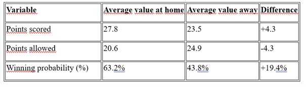
Table 2: Regression analysis of factors influencing home team wins
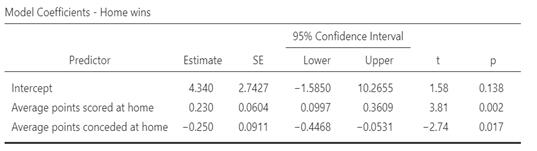
Table 5: Regression analysis of factors influencing away team wins
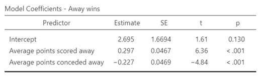
Table 6: Effect of points scored on winning
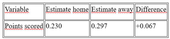
Points scored away have a greater impact on winning than points scored at home.
Table 7: Effect of points allowed on winning
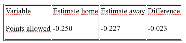
Points allowed home have a stronger negative effect on winning at home than away.
Teams score more points at home on average than away, while also having stronger defensive performance.
The probability of winning at home is higher (63.2 percent) than away (43.8 percent), confirming the home advantage hypothesis.
Points scored away have a greater impact on winning than points scored at home, suggesting that successful teams need to excel even in games played outside their home stadium.
Points allowed have a negative effect on winning both at home and away, but this effect is slightly stronger at the home stadium.
Overall, the models confirm that home advantage exists, but its effect may be smaller than expected, particularly for elite teams that perform consistently well away from home.
The analysis shows that points allowed have a greater negative impact on the probability of winning at home than away. This means that when a home team concedes points, its chance of winning decreases more than that of a visiting team in a comparable situation.This effect can be explained by several factors:
The home team faces greater pressure from fans who expect a victory. When the home team allows points, demoralization may occur, which affects on-field performance.
Coaches of home teams may be under pressure to respond quickly and adjust strategy, leading to greater risk-taking. Some teams adopt more aggressive play after conceding points, which can result in additional mistakes.
If a home team concedes, its probability of winning decreases by an average of 25 percent. For away teams, the decrease is smaller, averaging 22.7 percent.
These results suggest that the psychological effect of the home environment may in certain situations be more negative than positive, particularly when a team finds itself in a disadvantageous position. These findings offer a new perspective on the traditional concept of home advantage and indicate that the pressure associated with home games can be counterproductive for some teams.Although the analysis provides valuable insights into home advantage in the NFL, it is important to consider certain limitations.
Limitation to the 2024 regular season. The results apply only to this season and may not be fully generalizable to other seasons. Home advantage may change over time depending on league trends, rule changes, or competitive balance.
Individual team performance was not taken into account. The analysis worked with overall trends within the AFC conference, but specific teams may exhibit different patterns, for example some teams may have an extremely strong home record, while others may perform similarly at home and away, as well as differences driven by schedule strength.
This article confirmed that the home environment provides teams in the AFC conference with an advantage during the 2024 regular season, while also revealing several surprising nuances. While home teams show a higher probability of winning and better offensive and defensive statistics, points scored away play a more significant role in victories than points scored at home. In addition, psychological pressure after conceding points is greater for home teams, which may be an important factor in game strategy planning.References
ANDERSON, Eric, et al. (2012). Home Advantage in Professional Sports: A Meta-Analysis. Journal of Sports Science and Medicine
BALMER, Nigel J., et al. (2007). Influence of Crowd Noise on Refereeing Decisions in Association Football. Journal of Sports Sciences
JAMIESON, John P. (2010). The Home Field Advantage in Athletics: A Meta-Analysis. Psychology of Sport and Exercise
NEVILL, Alan M., & HOLDER, Russell L. (1999). Home Advantage in Sport: An Overview of Studies on the Advantage of Playing at Home. Sports Medicine
POLLARD, Richard. (2006). Home Advantage in Soccer: Variations in its Magnitude and a Literature Review on Inter-Related Factors. Journal of Sports Sciences
SMITH, R. S., & REILLY, Thomas. (1997). Influence of Travel on Performance in Sport: Implications for Performance and Recovery. Sports Medicine
NFL.COM (2024). Team Stats – NFL Statistics. [online]. Available at: https://www.nfl.com/stats/team-stats/LIVESPORT.CZ (2024). NFL – Results and statistics. [online]. Available at: https://www.livesport.cz/americky-fotbal/usa/nfl/
How to Visualize Data the Right Way part 1
Data visualizations often look objective and trustworthy, yet small design choices can dramatically change how we interpret them. This article shows how colors, ordering, scales, and chart types can subtly guide our attention, exaggerate differences, or hide important patterns. By understanding these common pitfalls, we can learn to read charts more critically and create visualizations that inform rather than mislead.
Color Highlighting: What Matters Should Stand Out
One of the most basic rules of good data visualization is working with color. If all elements in a chart are shown in the same color, then in practice nothing is highlighted at all. Color should be used only for the key element, such as one company, one country, or one specific result we want to draw attention to. Imagine a comparison of revenues among technology companies where we want to highlight Walmart. Walmart should be shown in its distinctive dark color, while the other companies remain gray. It does not matter whether Walmart is first or fifth in the ranking. What matters is that it carries the main message. A common mistake is the use of red, which automatically signals a problem or negative emotion and can also feel overly simplistic. A much better choice is to use a brand color when presenting results to a client, such as Spotify green or Amazon orange. Such a chart feels natural and the reader intuitively understands where to look. The difference between a good and a bad example is often just a single color, yet the impact on readability is substantial.
Graph 1: Right visualization (graph is interactive)
Graph 2: Wrong visualization (graph is interactive)
Battery Charts
Battery charts are often used to display scores, satisfaction levels, or performance on a simple scale. A typical example is customer satisfaction ratings for brands such as Netflix, Amazon, or Uber. The key issue, however, is not only the battery style itself, but especially the correct ordering of items. If brands are arranged randomly, the chart feels chaotic and the reader must work hard to identify the best and worst results. The correct approach is to sort the batteries from the most positive to the most negative values. The color logic should be clear and consistent, with green for positive results, yellow for neutral, and red for negative. When sorting by satisfaction, the company with the highest satisfaction score should appear at the top and the most negative at the bottom. The sorting variable is the satisfaction value itself, which determines first place, second place, and so on. For example, if Netflix has very high satisfaction and therefore a large green segment, it should be placed at the top. Poorly ordered charts can create the impression that differences are insignificant even when they are meaningful, or they may simply appear confusing. This is why battery charts are especially effective when a correct and an incorrect version are shown side by side.
Graph 3: Battery chart (graph is interactive)
Time Series and Missing Data
Time series charts are among the most common types of visualizations, but they are also where mistakes occur most frequently. If a certain time period is missing from the data, such as financial results during a crisis or a pandemic, we should not try to hide that gap. Imagine the development of Airbnb revenues before and after Covid, where part of the data simply does not exist. Filling in or smoothing the line would create a false impression of continuous development. The correct solution is to break the line or clearly mark the missing period. This approach openly acknowledges that the data are incomplete. Inspiration can be found in the book How Charts Lie, which shows how dangerous it is to connect points between which no data exist. Such a chart may be less visually appealing, but it is far more honest. The reader then knows that no conclusions can be drawn for that specific period.
Graph 4: Time chart (graph is interactive)
Graph 5: Chart visualization with missing data
Spaghetti Charts: The Problem of Clarity
Spaghetti charts, as I call them, arise when we try to fit too many time series into a single chart. A typical example is comparing the stock performance of several technology companies such as Google, Microsoft, Amazon, and Meta. At first glance the chart looks rich and informative, but on closer inspection it becomes cluttered and difficult to read. The reader does not know which line to follow and the main message gets lost. One solution is to highlight one key entity, for example Google, using color. The other companies are shown in gray and serve only as context. This approach works well when we want to tell the story of one specific subject. Without highlighting, the chart becomes a tangle of lines with no clear meaning. Good visualization helps the reader immediately understand where to focus.
Graph 6: Spaghetti graph (graph is interactive)
Spaghetti Charts: Splitting into Small Multiples
If we want to compare the development of multiple subjects on equal terms, it is often better to use so called small multiples. Instead of one overcrowded chart, we create several smaller charts with the same scale. A typical example is a Formula 1 season, where each driver has their own chart showing positions or points across races. This makes it easy to see how each driver performed over time. The same principle can be applied to companies, countries, or sports teams. The main advantage is much better readability and easier comparison. The reader does not need to decode colors or legends, but simply follows one story at a time. This approach is ideal when no single subject should be prioritized. The charts feel systematic and analytical rather than chaotic.
Graph 7: Spaghetti graf splitted (graph is interactive)
Comparing Two or More Categories: Horizontal Bar Charts
Horizontal bar charts are a very powerful tool for comparing categories. They are often used, for example, to display election results or candidate support. They work equally well when comparing customer satisfaction for brands such as Samsung, Apple, or Xiaomi. When comparing multiple categories, such as very satisfied, somewhat satisfied, dissatisfied, and very dissatisfied, a horizontal layout is clearer than a pie chart. The reader can directly compare the lengths of the bars, which is more natural for the human eye than comparing angles. This type of chart also handles longer labels very well. As a result, it is suitable for more complex data structures. In many cases, it can replace several pie charts with a single clear visual.
Graph 8: Horizontal bar chart with more categories (graph is interactive)
Graph 9: Horizontal bar chart with two categories
Relationships Between Two Variables: Showing the Trend
When examining the relationship between two variables, a scatter plot is often used. However, points alone may not be easy for the reader to interpret. For example, when showing the relationship between sugar consumption and the occurrence of tooth decay, individual points can appear chaotic. Adding a trend line helps reveal the overall direction of the relationship. The reader can then see that as sugar consumption increases, the risk of cavities also rises, even though individual values fluctuate. Of course, a trend line does not imply direct causation, but it greatly simplifies interpretation. Without it, different readers might draw very different conclusions from the same chart. A well used trend does not distort the data, but helps to read them. The goal is to show the relationship, not to overwhelm the viewer with detail.
Graph 10: Showing the trend-wrong one (graph is interactive)
Graph 11: Showing the trend-right one (graph is interactive)
How to Visualize Data the Right Way part 2
Survivorship bias
This article is also available on Spotify as an extended audio version. Click the Spotify or Apple podcasts button to listen
Survivorship bias is one of the most deceptive statistical distortions. It occurs when we analyze only the cases that survived, succeeded, or reached us, while ignoring those that disappeared from the data entirely. The result is conclusions that may sound logical, but are actually wrong. The following examples show how easily this bias can arise in war, science, animals, and also in sport and education.
When More Injuries Mean Fewer Deaths
One of the less known but very revealing examples of survivorship bias is the introduction of more modern military helmets during World War II. At a certain stage of the conflict, military commanders noticed an apparently alarming trend. After new, higher quality helmets were introduced, the number of injured soldiers transported to field and rear hospitals began to rise sharply. This effect raised doubts among commanders about the effectiveness of the new protective equipment. From a purely intuitive perspective, it looked as if the new helmets were failing because they were producing more injured soldiers. There were even discussions about returning to older helmet designs or limiting the use of the new ones.The core problem, however, was the way the data were evaluated. The analysis relied almost exclusively on data from military hospitals and medical stations. These data included only soldiers who survived long enough to be evacuated and treated. In contrast, data on those killed in action were not systematically included, even though other parts of the military recorded them, such as burial units. Once these datasets were later connected, a completely different picture began to emerge. It turned out that the new helmets significantly reduced mortality caused by head injuries. According to military medical statistics from World War II, the share of fatal head injuries dropped by tens of percent after the introduction of modern steel helmets, with some units reporting a decline of approximately 40 to 50 percent compared with earlier equipment.At the same time, the number of soldiers with non fatal head injuries, concussions, or shrapnel wounds increased, but they survived. These soldiers would have been far more likely to die on the battlefield in earlier stages of the war, and they would never have appeared in hospital statistics at all. The rise in the number of injured soldiers was therefore not evidence that the protective gear had failed. It was evidence that it worked. Helmets were turning immediately fatal hits into survivable injuries. Statistics based only on hospital data, however, completely distorted this positive effect. In this case, survivorship bias did not only lead to a wrong statistical conclusion. It almost led to a wrong strategic decision. Only by including complete data on both the injured and the dead was it possible to interpret the situation correctly and confirm that the new helmets were saving lives.
Aircraft in World War II: Where to Add Armor
The most classic and now textbook example of survivorship bias is the analysis of damage to military aircraft during World War II. This problem was addressed by the British and American air forces as they tried to reduce the heavy losses of bombers during raids over occupied Europe. Every lost aircraft meant not only a destroyed machine, but also the loss of a multi person crew, which created a serious strategic problem. The military therefore began to systematically collect data on aircraft that returned from combat missions. For these planes, bullet and shrapnel hits were recorded in detail. The statistics showed that the most frequent damage appeared on the wings, the rear sections of the fuselage, and around the tail surfaces. At first glance, it seemed logical to add armor to these parts of the aircraft, because that was where the largest number of hits occurred.This intuitive conclusion was challenged by the mathematician Abraham Wald. Wald pointed out a fundamental error in reasoning. Only the aircraft that returned from missions were being analyzed. Data on the aircraft that were shot down and never returned to base were completely missing. These invisible aircraft were the key to understanding the problem. Wald noticed that some parts of the aircraft, especially the engines, the cockpit, and the fuel systems, showed surprisingly few hits on the planes that came back. This did not mean those areas were hit less often in combat. It meant that hits in those areas were highly likely to be fatal. If the engine or cockpit was struck, the aircraft simply did not return, and therefore never entered the dataset.

Source: https://rossgriffin.com/concepts/survivorship-bias/
Based on this reasoning, Wald recommended adding armor precisely to the places where hits on surviving aircraft were almost absent. Specifically, this included the engines, the pilot compartment, and certain fuselage sections near fuel tanks. At first, this approach seemed counterintuitive to military leadership because it went directly against the visible data. After implementation, however, there was a measurable reduction in bomber losses. According to later analyses, optimized armor placement led to a reduction in aircraft losses by single digit to lower double digit percentages depending on mission type and deployment. This case became an iconic example showing that missing data can carry critical information. Wald’s analysis demonstrated that focusing only on surviving objects leads to systematically incorrect conclusions. Here, survivorship bias was not just a theoretical statistical issue. It was a matter of life and death. This example still serves as a warning that when analyzing data, we must ask not only what we see, but also whether something is missing from the data, and why. We should not look only at results, but also view the case from other angles that may reveal what the numbers alone do not.
Why Athletes Are Winter Born and Academics Are Autumn Born
Survivorship bias also appears very strongly in birth date data among successful people. Among elite athletes, this phenomenon is one of the best documented. Research consistently shows that athletes born in the first part of the year are significantly overrepresented compared with those born later in the year. For example, in the Canadian NHL, analyses by Rodger Barnsley found that approximately 40 percent of players were born in January through March, while only 8 to 10 percent were born in October through December. In the general population, birth distribution is close to even. This difference therefore cannot be random.A similar pattern appears in European football. UEFA studies show that in youth academies of elite clubs, up to 60 percent of players are born in the first half of the year. Among famous athletes born very early in the year are, for example, Cristiano Ronaldo (5 February), Neymar (5 February), Buffon (28 January), all football, Wayne Gretzky (26 January), Jaromír Jágr (15 February), or Phil Esposito (20 February). These visible examples stand out, while thousands of less fortunate talents born later in the year disappear from the data entirely.
The mechanism is simple. Children born in January are almost a full year older than children born in December within the same youth category. In youth sport, this difference creates a major physical and psychological advantage. Coaches therefore more often select the older children because they show better immediate performance. These children receive more training, better conditions, and greater trust. Professional sport statistics then show only those who survived this selection. The others, often equally talented, are missing from the data. Here again, survivorship bias is at work.Interestingly, the opposite pattern appears in academic success, especially among Nobel Prize winners. Analyses suggest that Nobel laureates have an above average share of births in autumn, especially in September and October. For example, studies published in the Journal of Biosocial Science found that roughly 30 to 35 percent of Nobel Prize winners born in the Northern Hemisphere fall in the period September through November, while spring months are represented much less.
Well known Nobel Prize winners born in autumn include, for example, Niels Bohr (7 October), Richard Thaler (12 September), or Marie Curie (7 November). Autumn births repeatedly appear among scientists who followed long academic careers.The explanation again does not lie in biology, but in the system. The school year begins in autumn. Children born shortly after the start of the school year are the oldest in their class. They often have greater cognitive maturity, better early educational results, and more frequent positive feedback from teachers. This increases their confidence and willingness to continue studying. These small advantages accumulate over time and increase the probability that a child will pass through the entire education system to its top levels. Nobel Prize statistics then again show only the survivors, not everyone who could have succeeded but dropped out earlier.Survivorship bias in this case creates the impression that success is linked to the birth date itself. In reality, it reflects the structure of the systems people move through. The data are correct, but without understanding who is missing from them, they lead to incorrect conclusions. Exceptions can of course be found in both sport and science, but those are precisely the cases that had lower odds of reaching the top.
Social media